#UXdesign #UIdesign #DataVisualisation #Accessibility #Maps
Applied Works
For the Cisco Transparency Report microsite, I was actively involved in the whole process.
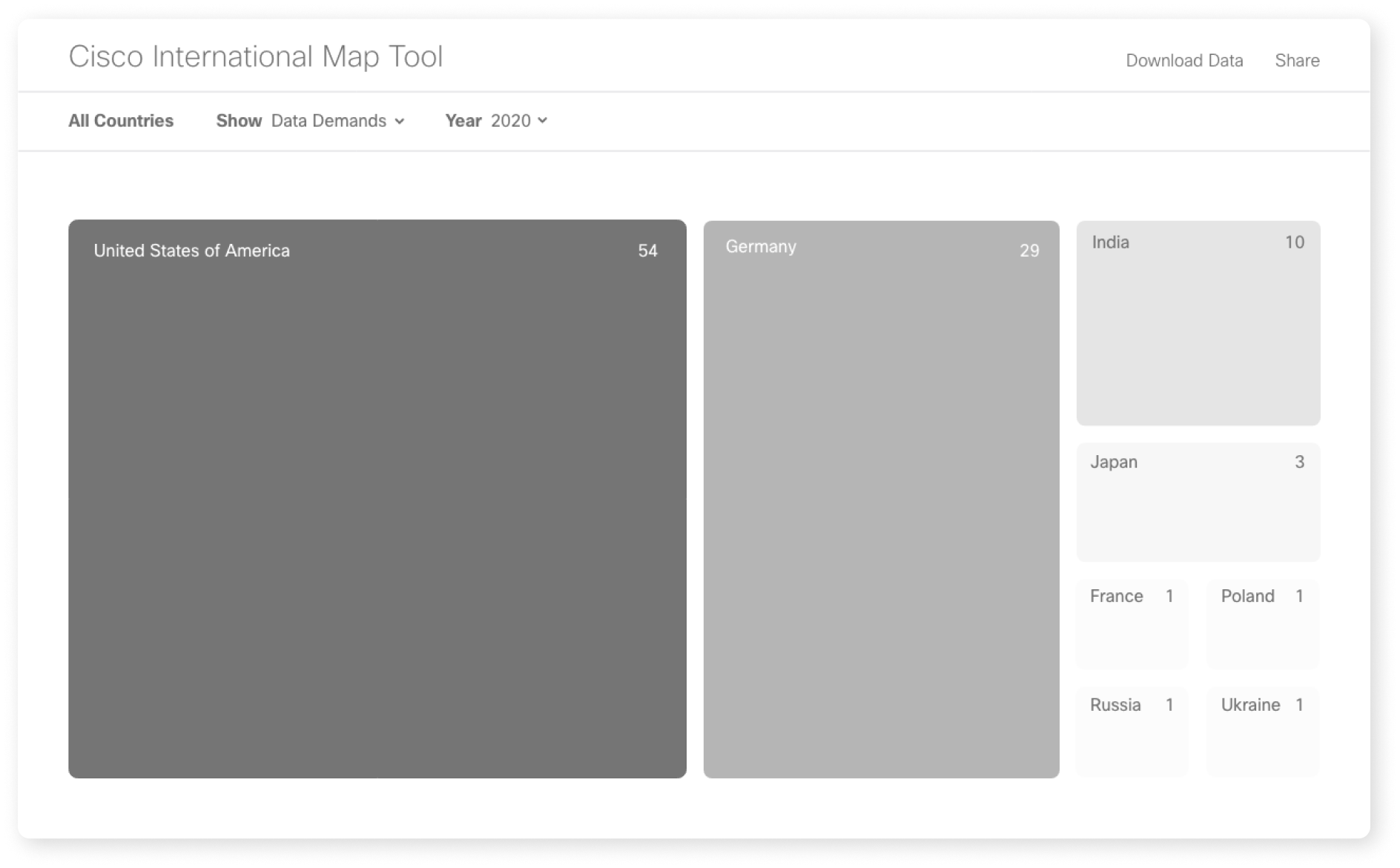
The initial phase focused on determining how to effectively present global data on an interactive map, all while adhering to the strict guidelines provided by the client. This resulted in a series of consolidated wireframes that served as the blueprint for the site's structure and user flow.
During the design phase, the UI underwent refinement across all device formats. A minimalist colour palette was established to ensure clarity and visual cohesion, and final adjustments were made to the layout and functionality, ensuring the microsite met both user experience and client expectations.
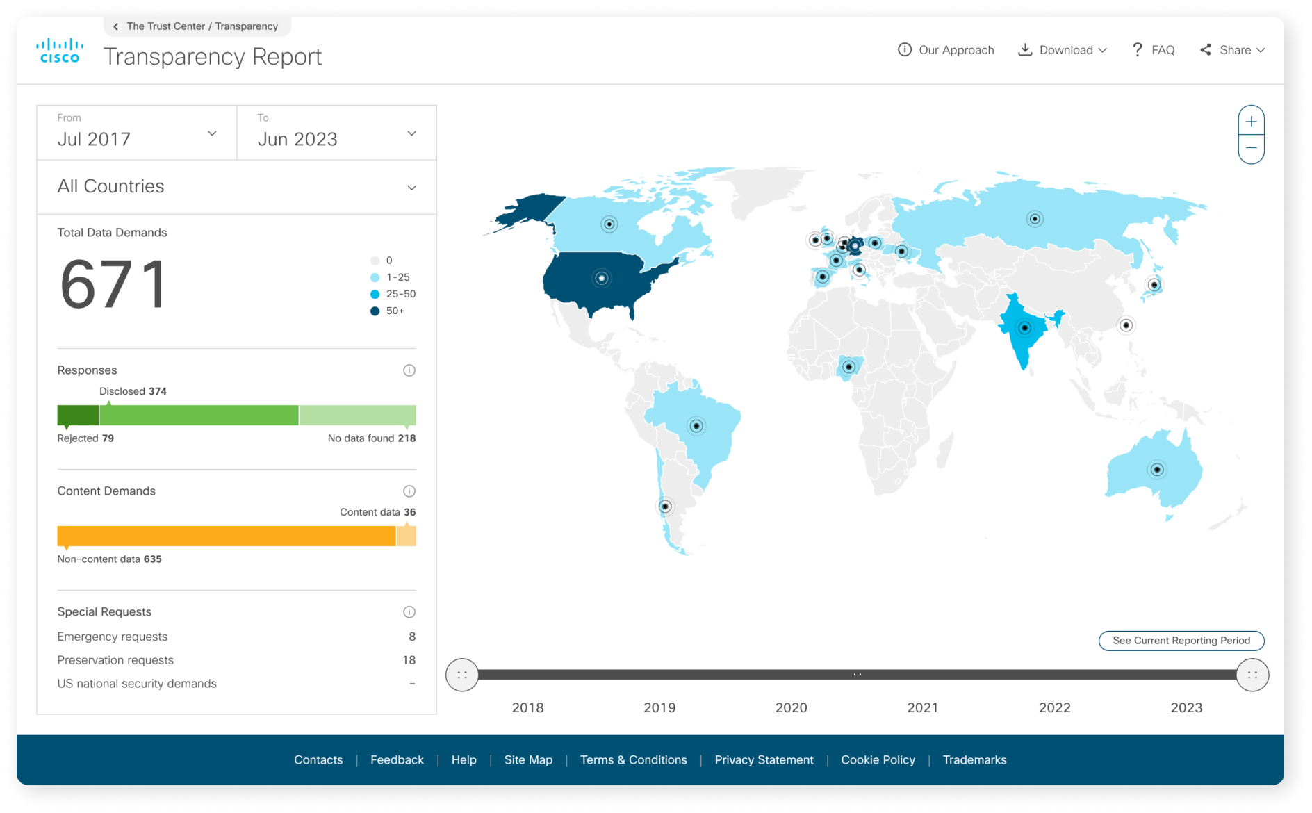
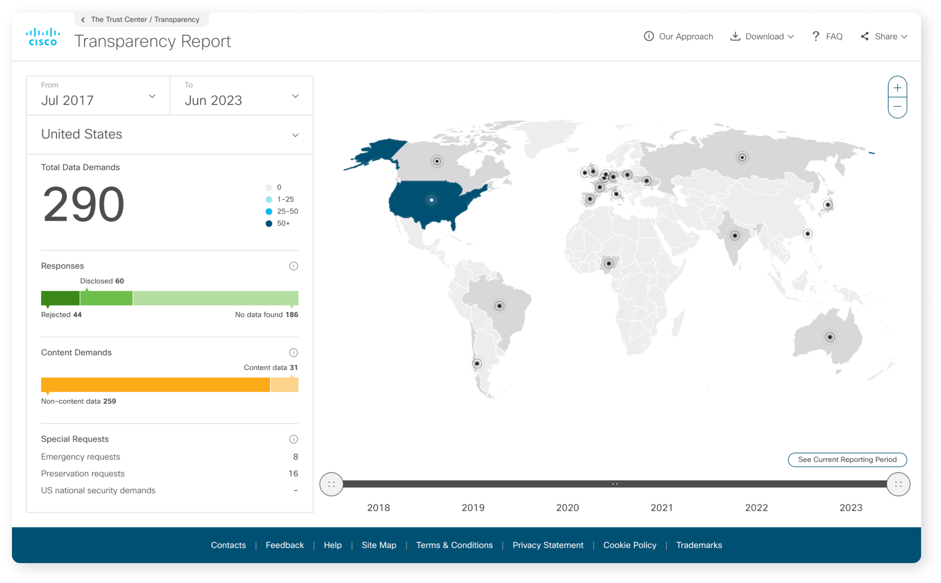
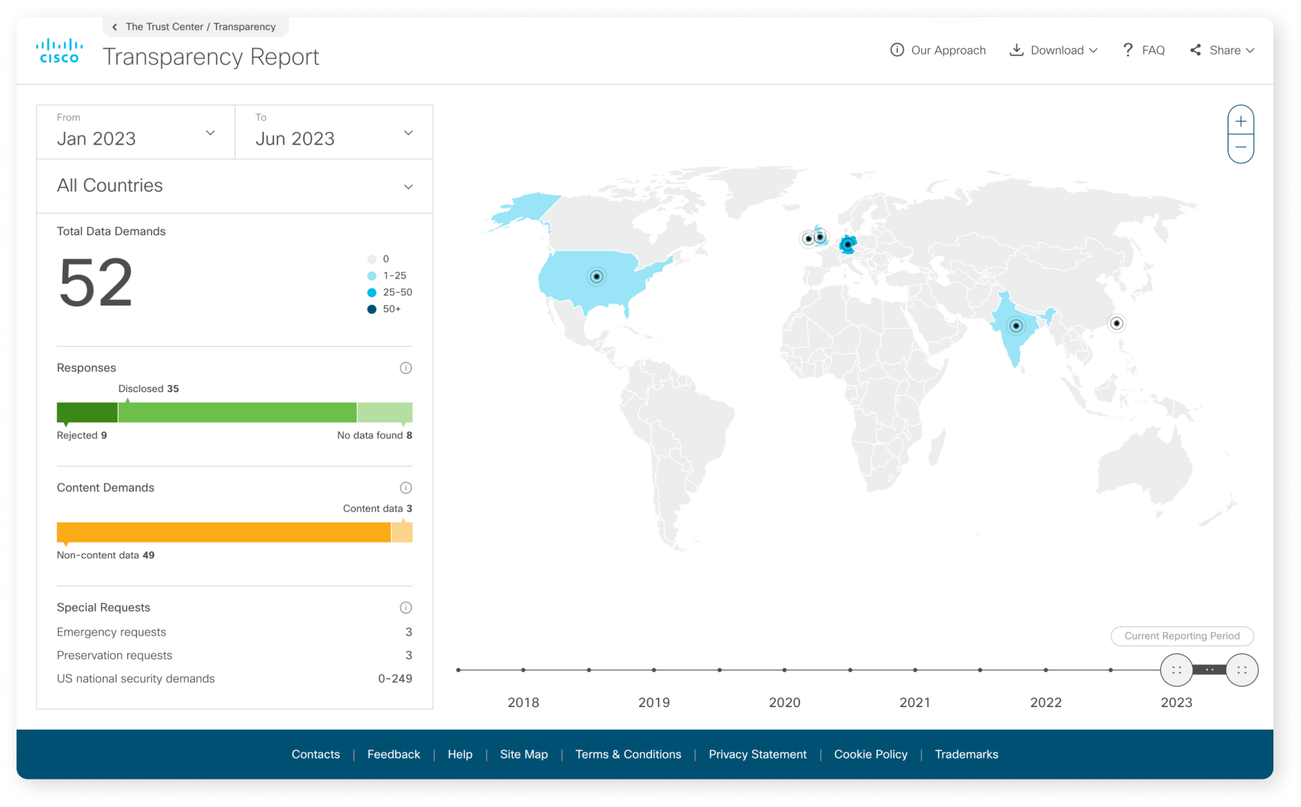
The landing page of the Cisco Transparency Report features an interactive map, where users can select specific countries and dates
The wireframing phase entailed extensive exploration of different methods for displaying the data, spanning from stylised designs to more realistic representations.
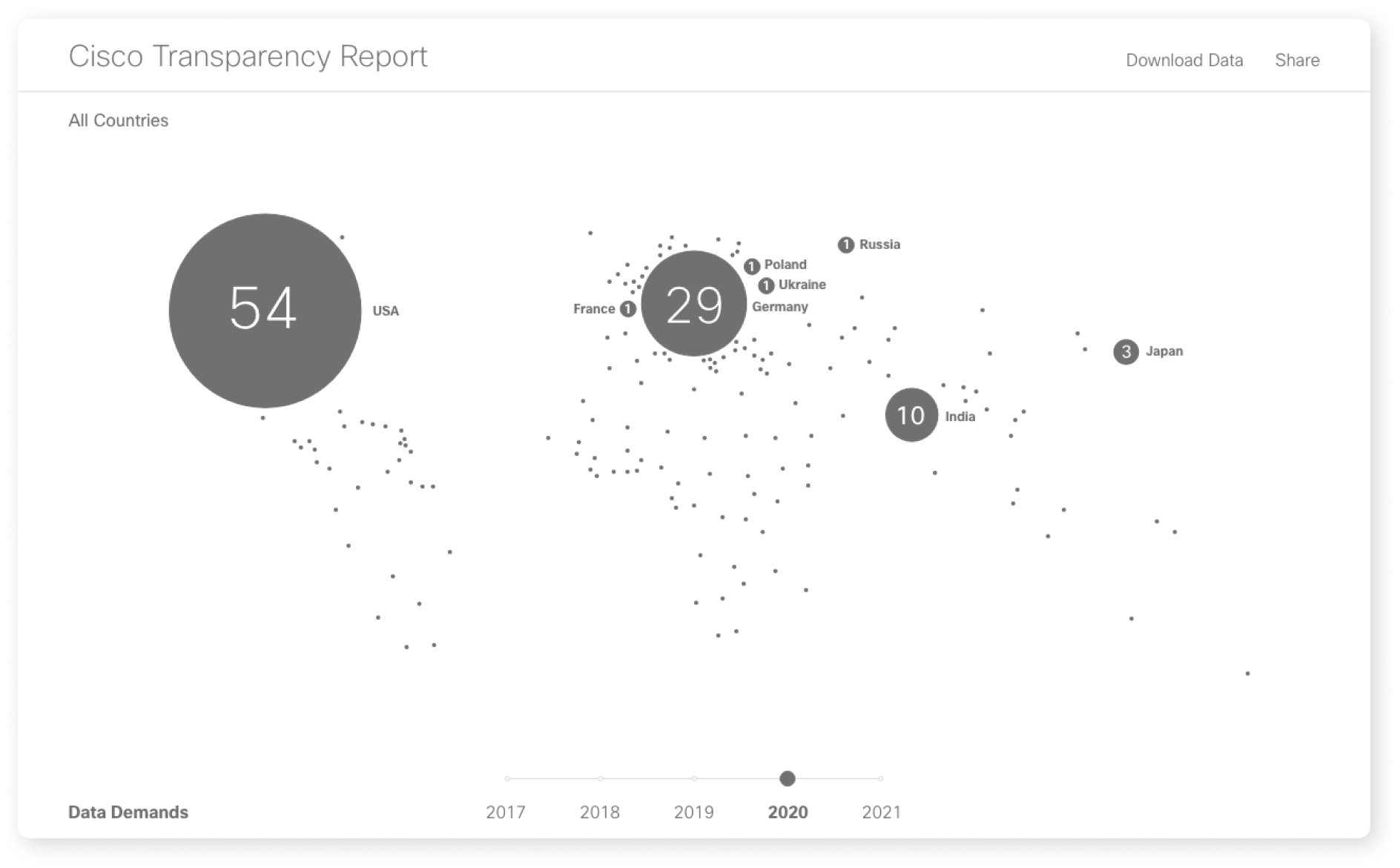
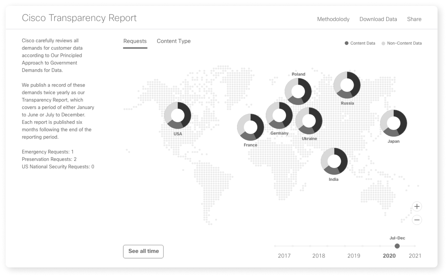
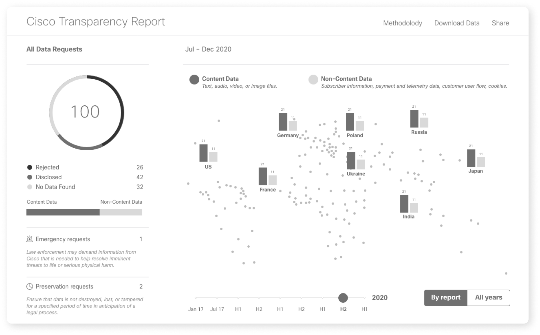

As users interact with the map, the left-hand panel automatically updates to display detailed information corresponding to the selected country and date range. This dynamic connection allows for an easy exploration of the data across different locations and timeframes.

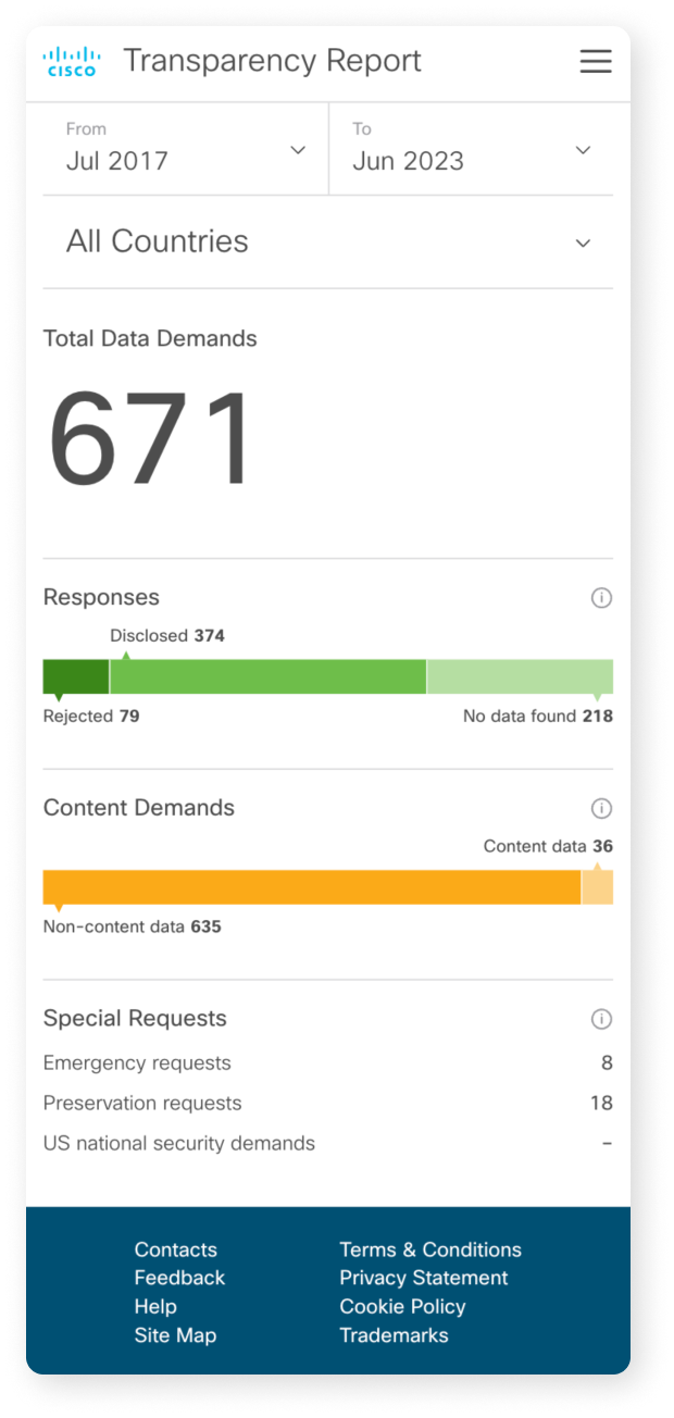
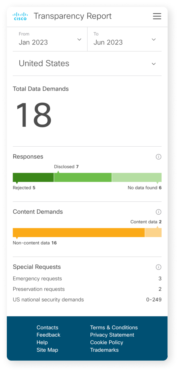
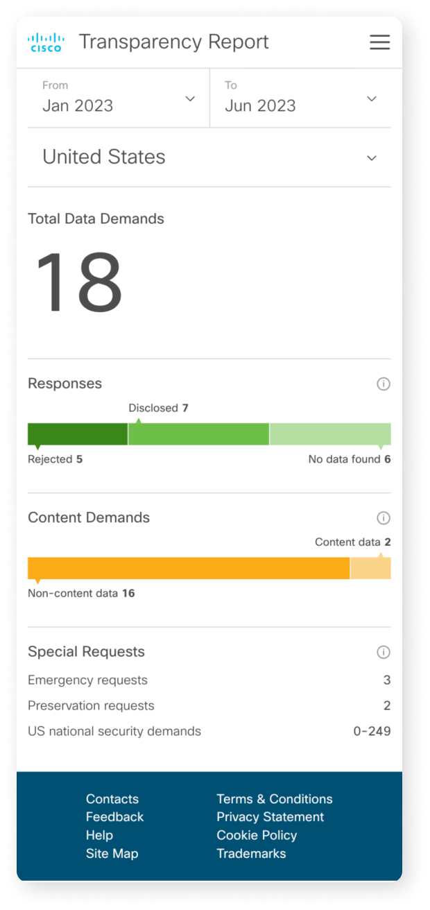
The mobile design has been optimized, with the map removed for simplicity. Users can access the data via selector fields, and the charts will update in real-time based on the selected criteria.