#UIdesign #DataVisualisation #DesignSystem #Accessibility #Charts #Maps #Prototypes
Applied Works
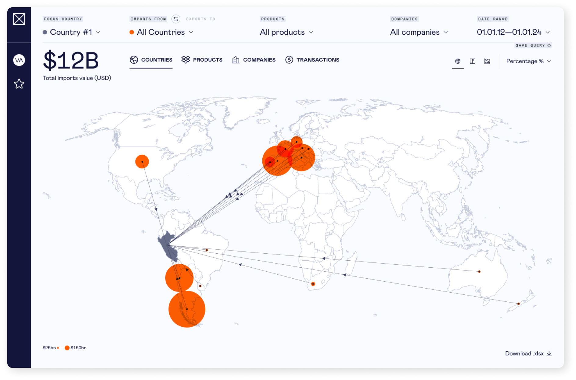
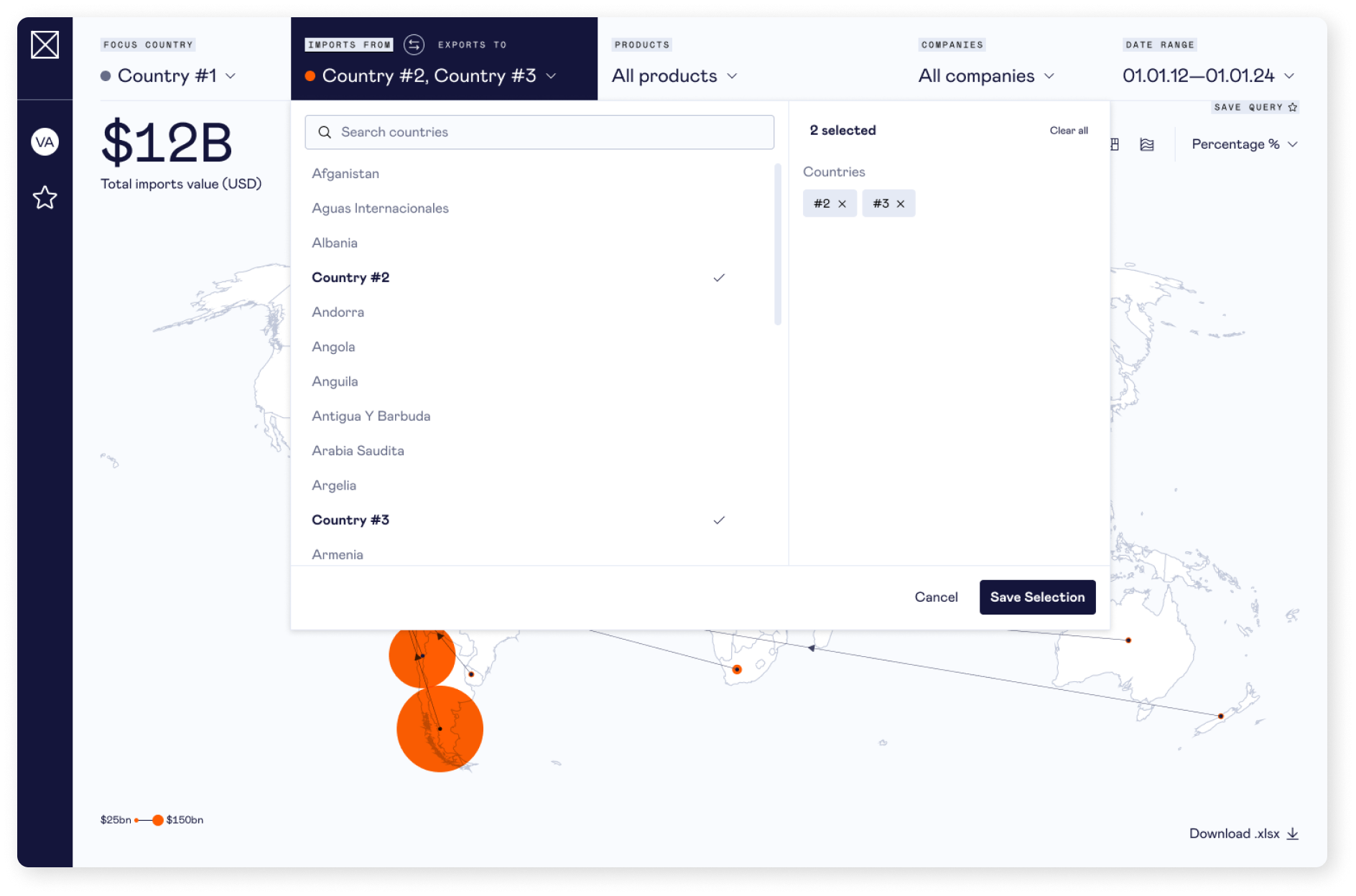
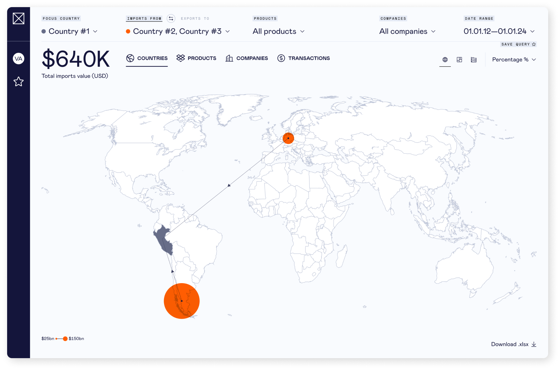
Concept designs for an online platform designed to track global product trades, empowering market participants—buyers, sellers, and analysts—to stay ahead of competitors, monitor market values, identify emerging trends, etc,
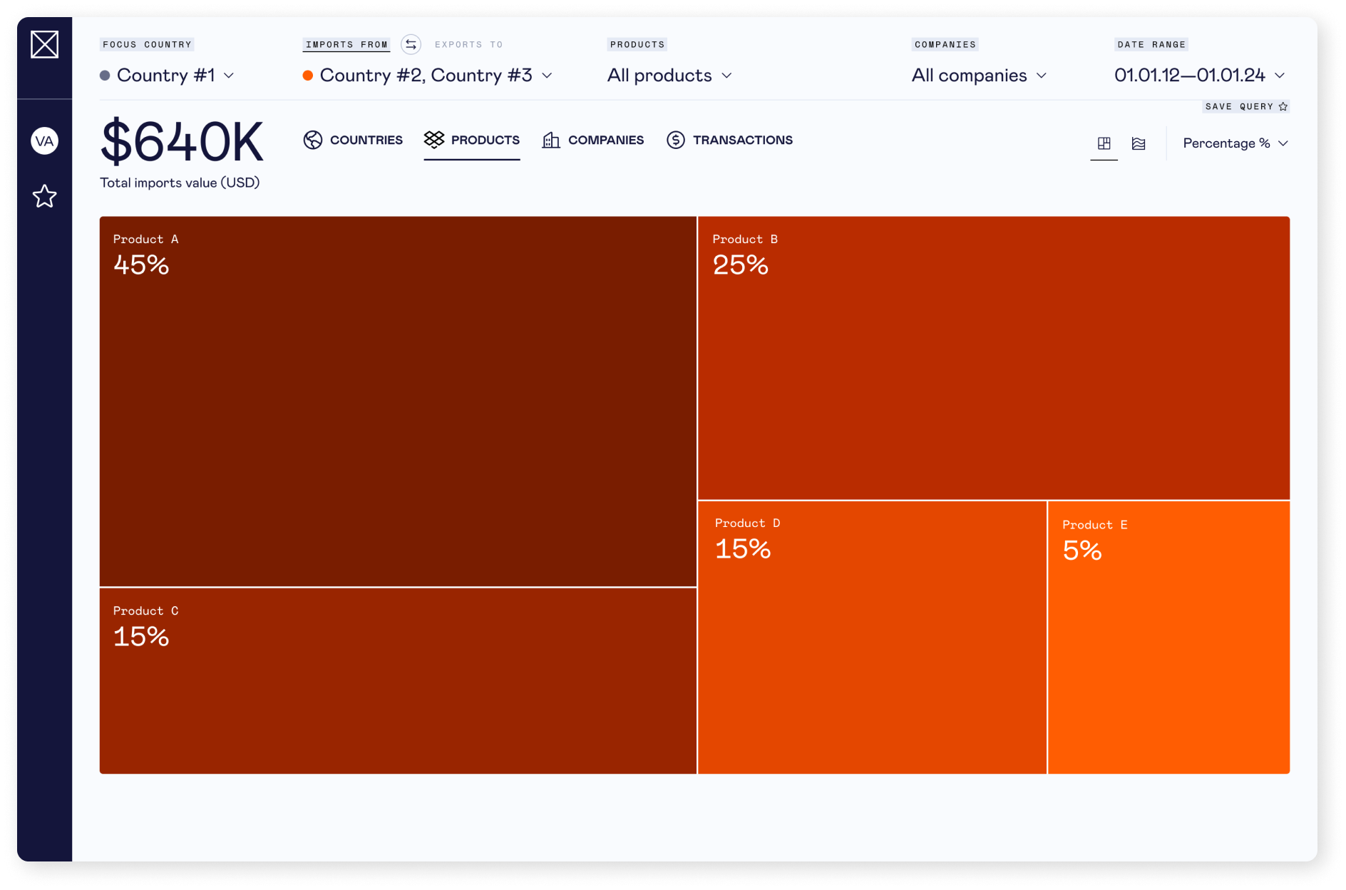
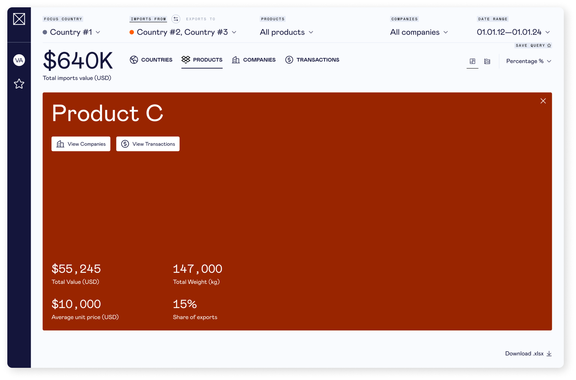
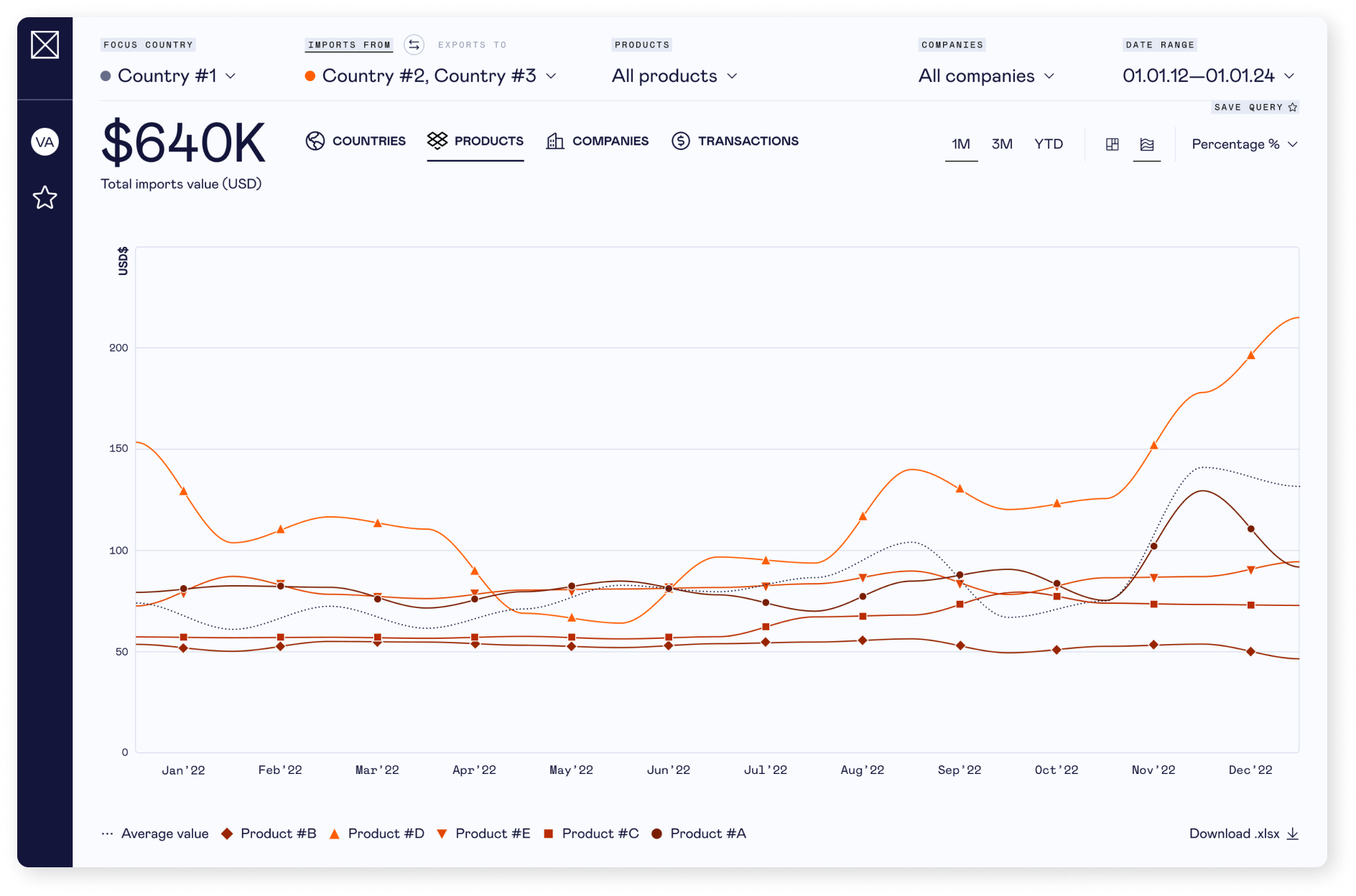
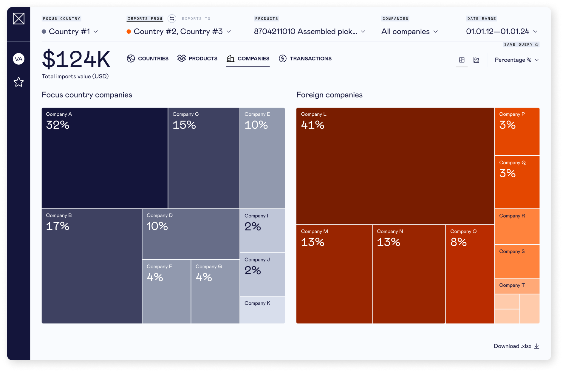
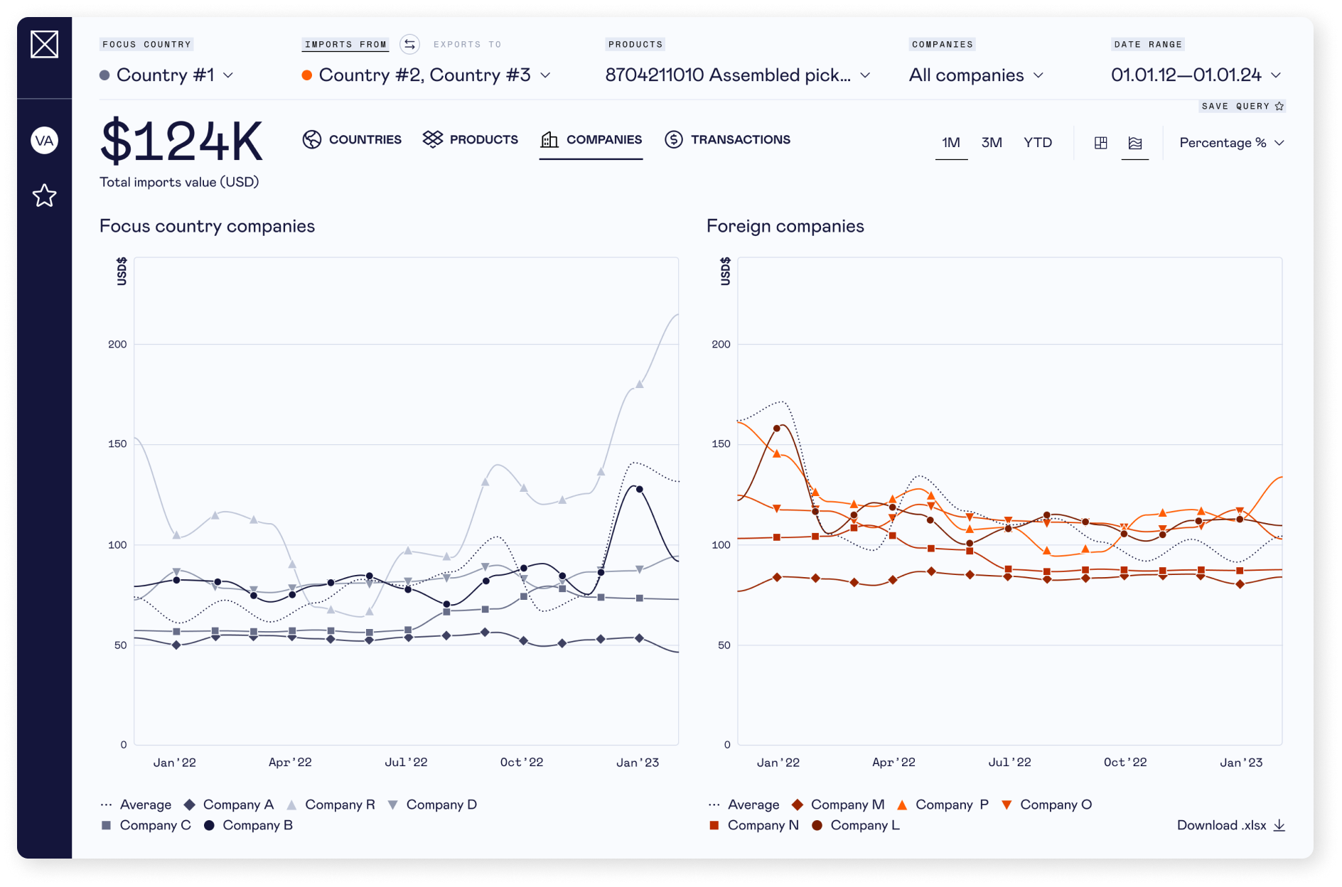
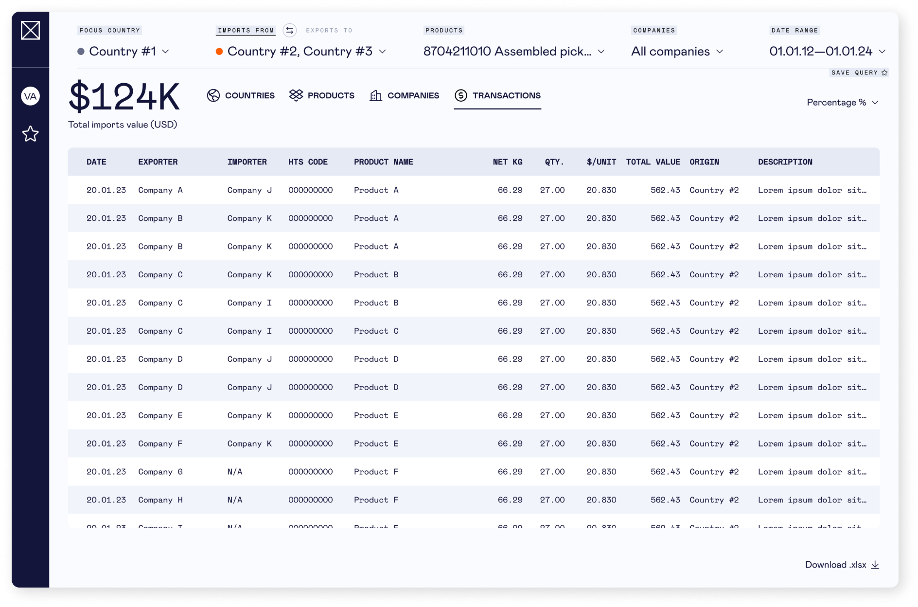
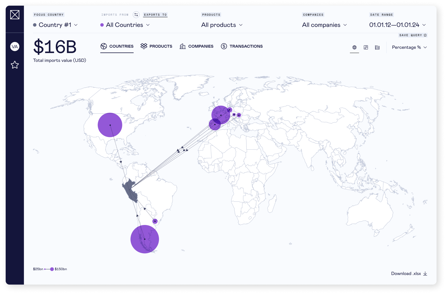
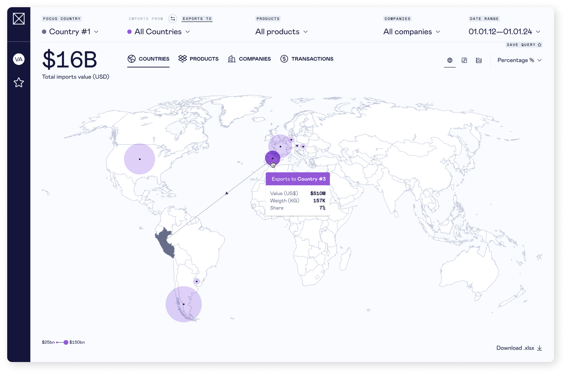
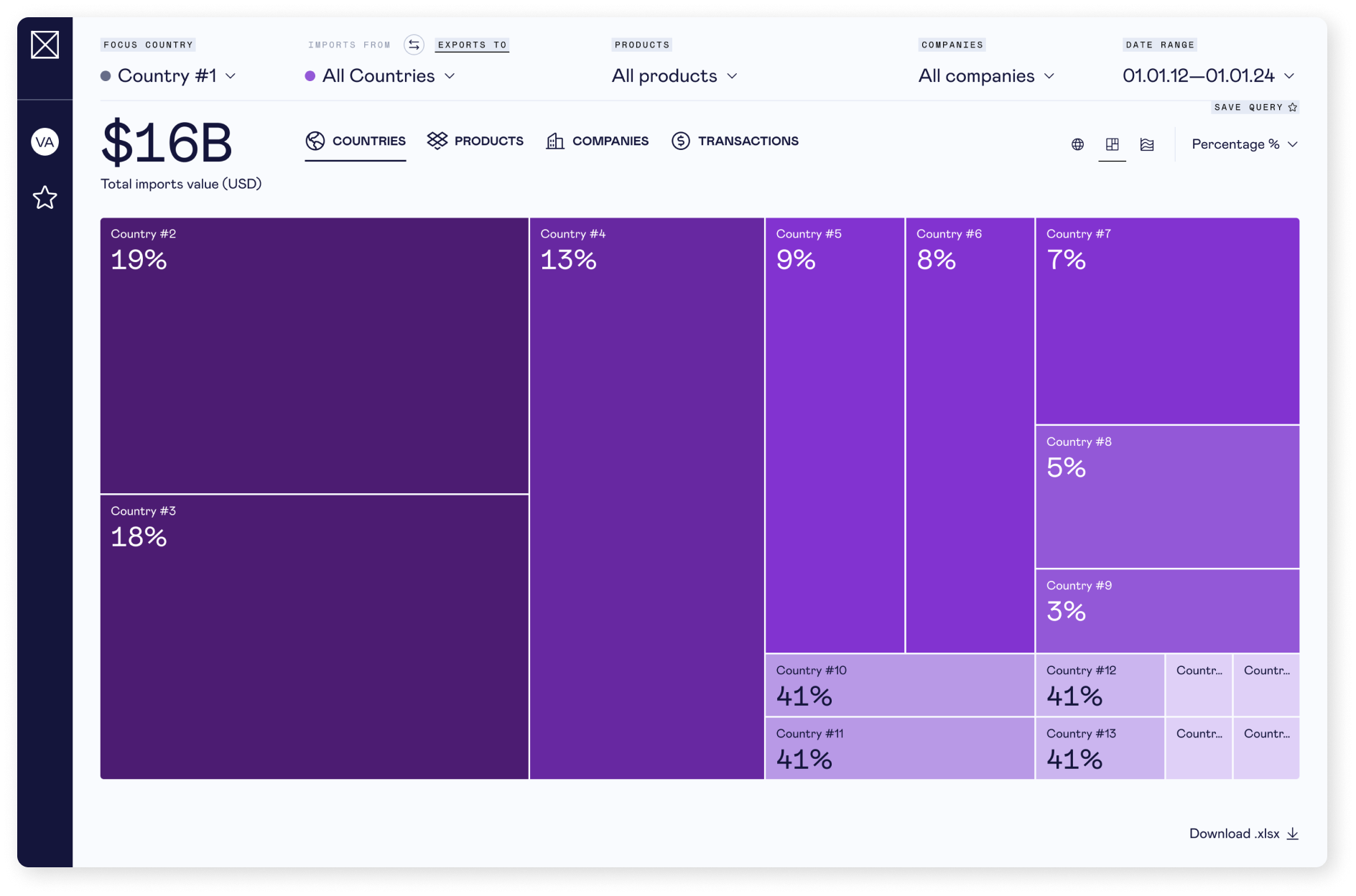
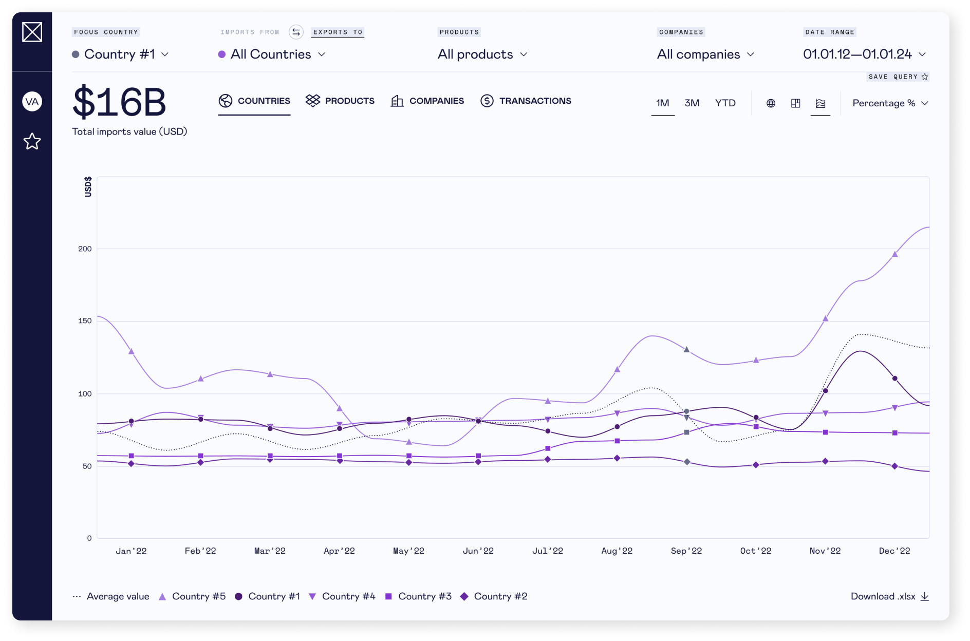
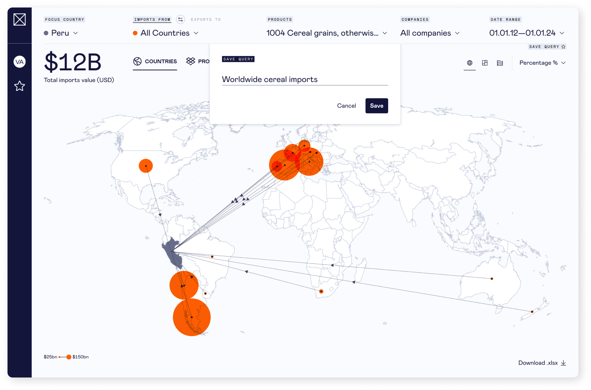
How to visualise trades globally multiple perspectives (country, product, company, transaction). Implement a wide range of filtering and sorting options.
I was in charge of the whole UI design process. To present insights effectively, a dual-colour coding system was implemented – orange for imports / purple for exports – and three primary data visualisations were developed: an interactive world map, a tree map, and a line graph, complemented by a detailed data table for in-depth transaction searches. All charts are fully interactive, providing an intuitive analytical experience.